Uncategorized

Bright Floral Card

My entry for The Card Concept 136. I was inspired by the colours and layout. But I think that’s pretty obvious. 🙂

On my Clean and Layered card’s background I embossed with a folder then heat embossed the raised areas with @wowembossing Matt Dull powder. It intensifies the colour like clear embossing powder but isn’t shiny. The flowers are by @concordand9th Fine Line and Filled in Florals dies. I cut the outline with solid coloured cardstock and the backs with vellum. Then I layered the flowers with glue and foam adhesive for the large pink one. Not sure if you can see but I did brush some ink on to the center of the flowers to add intensity.

Enjoy, Rebecca

Cards

An Oceanic Tribute to Joanne Grzelak

Joanne was one of the founding members of the Crazy 4 Challenges blog. Sadly she passed a few weeks ago. So we decided to create a Tribute Blog Hop, with all of us creating in a style she loved which included everything related to the ocean.

beach baby1.jpg

So I created 2 ocean cards and a little beach shack. I’m sure she would love them as they truly celebrate the beauty of the sea. My first card uses a Beach Baby image by Penny Black. I coloured it a while back but it took me a while to find the best way to use it.

beach baby2.jpg

She is done with Copics but the background is done with watercolours. I also added a few shells from the Beach and Sea set by Hero Arts.

beach n sea dolphins.jpg

This card uses the same Hero Arts set. I wanted to make it look like the dolphins were in the foreground, not sure if I achieved it or not. As I was photographing it, I noticed my perspective was off on the waves. I think the white caps should be wider near the bottom of the card to make that area look nearer.

beach n sea dolphins2.jpg

I added the white with Copic white paint. I used Daniel Smith Kyanite for the dolphins, it’s the perfect grey-blue with flecks of glitter in it. I can’t wait to use it again!

ocean beach shack.jpg

This adorable little box is by Lawn Fawn as well as the additions dies to make it a beach shack. It’s the most fun thing to put together, my kids both beat me to it! All the pieces were die cut and most inked to get an authentic worn beachy look. Using some tiny makeup-style blending brushes helped a lot as I’d already put it together when I decided to add the ink. I’m thinking of placing this in an upside down canvas with some sand mixed with glue to make an entire little scene including palm trees, a hammock and a clothesline with tiny bathing suits hanging on it.

I hope you will continue along the blog hop to pay tribute to dear Joanne. Please feel free to leave comments along the way with memories of her. I’d like to extend my condolences to her family and close friends.

Thank you, Rebecca

CCEE Stampers

Frances Byrne

Lois Bak

Karen Ostergard

Liz Williams

Vicki Garrett

Rebecca Ednie

Kelly Santi

Karen Aicken

Vicky Gould

Maryann Einam

Anne Harmon

Nicky Foden

Lynn McAuley

Kathleen Adams

Crazy 4 Challenges


Cards

Art Deco Cupcake Celebrate Card

It’s the last Crazy 4 Challenges of the month! I’ve seen so many fun fold cards around lately that I decided we would make trifold cards this week. There are a lot of different types so if you play along, find one you like and join us!

c4c 19 trifold cupcake

If you’ve never made a trifold card before, it has at least 3 panels and 2 folds. Mine is made with a white card base and an aqua card base nested together. The front of the white card base is cut with the same die as the black cardstock. This makes it see through. I added some gold glitter vinyl to the inside. I was inspired to go for this art deco look because the cupcake set from Altenew included sentiments in a font that looked art deco to me. Then I remembered this die by Hero Arts from a previous card kit.

c4c 19 trifold cupcake2

I was also inspired by see-through cards by Jennifer McGuire. The open area in the cover die made it kind of flimsy which is why I used two layers of cardstock but adding the cupcake helped too. There is a second cupcake die cut behind the front cupcake so the cover die is sandwiched between them. I hope that makes sense. Then I also added a plain cupcake die inside the card with the fun sentiment! To get it lined up, lay the card open on your table and place the sentiment die cut face down on the back of the front cupcake die cut. Make sure it already has adhesive on it. Then close the card while leaving the front panel on your table. It should stay lined up perfectly.

c4c 19 trifold cupcake3.jpg

For finishing touches, I added a celebrate die cut to the inside and some gold confetti to the cover die. I thought the confetti really added to the art deco vibe. If you are interested in trying some trifold cards, check out the links over at C4C. I found a ton of inspiration on Jennifer McGuire’s blog so pop on over. I hope you’ll find one you line and join us this week!

Enjoy, Rebecca

Cards

3 Cheers! A Shabby Celebration Card

The challenge I came up with for this week for Crazy 4 Challenges was a colour combination! The weather is so nice that I had to pick beachy colours. The Bobbi Brown eye shadow palette included the perfect shades.

c4c 19 june colours zebra journal card.jpg

The zebra image is a journaling card from The Carousel collection by Maggie Holmes for Crate Paper. The other embellishments and papers are also by Maggie but a few are from other collections. It’s so perfect that they included all the colours I needed.

bobbibrown

I had a hard time finding a good image. But the colours are mint or aqua, blush pink or peach and gold, tan or kraft. When I took the photo and edited it, I had a hard time making the colours look as pretty and soft as they are IRL. The aqua looks too bold and the pinks and peaches are too soft.

c4c 19 june colours zebra journal card2

This one shows the colours better but it looks washed out to me. Sigh. I hope at least one looks good on your screen! I just realized that the white floral paper doesn’t even show the amazing foiling. You can see a hint of it under the balloon string.

So, if you can overlook the poor photography, and you like the colours, I hope you will join us over at the Crazy 4 Challenges blog and link up a card or other project!

Enjoy, Rebecca


Cards

Soft n Shabby Mermaid Card

I’ve got to say, I am LOVING the awesome weather we are having here! And I just got my Hero Arts My Monthly Kit along with a special edition set from the Vault I ordered. Did you know they’ve brought back some older sets for their 45th Anniversary? So I used Beach and Sea for my card today.

c4c 19 mermaid.jpg

I’m also using the sketch I designed for the Crazy 4 Challenges blog this week. It’s a classic I can never use too often! The image was stamped with Antique Linen Distress ink on ivory cardstock. I kept the colours as soft as possible to match the Authentique papers I’d chosen.

c4c 19 mermaid2

The rocks were surprisingly challenging as I needed them to be all different colours or they’d look like a giant blob. Plus it took a lot of shading to make them look realistic. It’s quite small so that makes it even harder. In the end, I needed some coloured pencil to get the shading just right. But that’s ok, I’m adding it to my Copic colouring more and more often lately.

C4C488Sketch

The hello die is from Spellbinders from a monthly club kit. The frame and border dies are also SP, funny, I didn’t plan it that way.

c4c 19 mermaid3

I know the weather is nice right now, at least in the Northern Hemisphere, but I’m sure a rainy day will come along so you can join us over at C4C to play with us using this sketch! You can of course flip or rotate the sketch or choose different shapes like I did!

Enjoy, Rebecca

Cards

Beach Retirement Card

This week, my challenge over at Crazy 4 Challenges was to use sand. Real sand, images, sandpaper, whatever works! I have plenty of sand images so I checked through my Summer stamps box and grabbed a set of stamps from a Hero Arts kit.

c4c 19 sand.jpg

I stamped two layers of the ocean but used the last layer to create surf on the top of the waves. If you have this set, you omit inking the solid section that creates the horizon line and, once heat embossed, you get perfect white caps! I used puff embossing powder this time to get a 3-D look. I also added a few more waves with an embossing pen. Previously I’d cut a mask to cover the waves so I could ink the sand. Always be sure to save those!Then I used a very old Stampin’ Up! stamp to create texture on the sand with two darker I inks and some copper pigment ink. It makes the sand shine and sparkle. Gold works very well too.

I wanted some detail in the ocean so I used a Kaisercraft set called Sandy Toes to add the island. I selectively inked it to get the various colours as it’s a one piece stamp with no layering stamps. I also added the sailboat from the Hero Arts set and the sea gulls. I stamped them in 3 different greys to make some look closer and some further away. I added stenciled clouds and sky and the shells to the beach along with the sentiment. But I thought it needed one more thing to complete the card. So far this was a one layer card which is something I hardly ever do. But I just had to add some die cut beach chairs also from the Hero Arts stamp set.

Enjoy, Rebecca

Cards, Uncategorized

Wild Roses and Woodgrain Card

Guess what? I’m back as hostess on the Crazy 4 Challenges blog this month! I love being hostess in the summer as I am a huge fan of everything summery, the ocean, beaches, flowers, even the outdoors if I could eliminate insects and creepies! So this week our challenge is to use woodgrain!

c4c 19 woodgrain

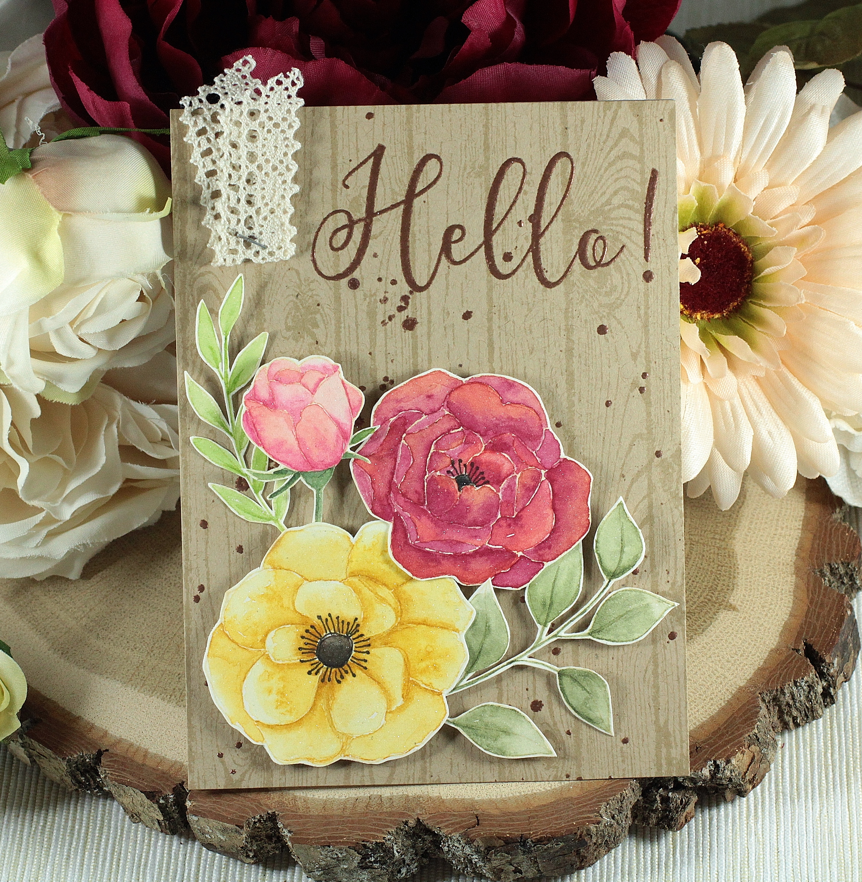
I just got a new woodgrain stamp from Stampin’ Up, the first I’ve bought in at least 5 years. So it was perfect for this challenge. I stamped it in Simon Says stamp Khaki ink on PTI kraft cardstock. It was the subtle but not too much so. The flowers are from Simon too, the Delicate Flowers stamp set. I stamped them in Antique Linen Distress ink on some hot press Arches watercolour paper. The ink was quite noticeable at first but melts into the watercolour as you paint. I know some people don’t like that and it might not be ideal for animals or people because you can end up washing away the face detail but for flowers and leaves it’s perfect.

I painted the images with Daniel Smith paints and a Black Velvet Silver Brush. Each petal was done separately using a wet-in-wet technique so I would get a deeper coloured edge to each petal. This happens naturally as the paint dries. I also added some deeper colour at the base of each petal while the paint was still wet. In the case of the pink flowers, I added two colours, one to the tops of the petals then dropping in another colour at the base. Sometimes the colours blended on their own and sometimes I helped them along a touch with my paintbrush. To save paint, it helps to use one for each colour and one for water. This way you aren’t constantly washing paint off your brush! It may not be much but I’m sure it adds up over time. The pale pink flower is my favourite. I love the soft blush shades I managed to achieve.

I added the Hero Arts sentiment with copper embossing powder. Then I decided I needed some more copper. So I tried a trick I’d seen on YouTube, I think it was Kristina Werner. I sprayed some water from my spray bottle into my hand then added embossing powder. It won’t stay on long enough to heat set, it will blow away. So heat it from underneath! It worked out perfectly! But I still wanted some copper drops in some other, specific places so I used a Versamark pen. I worried that they might look too perfect but they blended in well.

I hope you can join us over at the C4C blog this week. We also have a sad announcement over there about a team member who passed away. So sad.

Rebecca

Cards

Happy Wine Day? A Wedding Card

You know those weird calendar dates that no one really knows? Well Saturday was Wine Day and the theme for this week’s Crazy 4 Challenges! I know right?!! LOL! So I have a very few cocktail stamps but only one teeny little wine stamp. Being so small and not having any accompanying sentiments, it would be very tricky to base a card on it. So I searched my stash for something to use. I thought some collage sheets with 1950’s domestic graphics and memes might have some snarky wine comments but nope. I finally looked through my wedding stuff and ta da!!

c4c 19 wine wedding card (2)

I found a sheet of stickers from the dollar store! It was seriously old and the ribbon on the glasses and dress had aged badly. So I removed them and added some of my own embellies. The hearts were cut with Hero Arts nested circle dies from some shimmery vellum. I added them to help ground the layered stickers. The paper is by My Mind’s Eye, one of my favourites of all time. I could use up an entire pack of paper with just this one pattern! The gold foiling is awesome. The sentiment is from Simon Says Stamp on ivory cardstock with Wow gold sparkle embossing powder. Last I added the bow which is pink and champagne (how perfect right?) silk from May Arts. So I suppose I need to get some wine stamps and dies. I do have a few sets on my wish list but I have to save up some more!

If you have some wine themed crafty items, come on over to the C4C blog and play along. We’d love to have you join us for our wine challenge.

Enjoy, Rebecca

Cards

Shabby Thankful Rose Card

This is the third week of the month at Crazy 4 Challenges so we have a sketch! I found this one a bit tricky so it doesn’t look very much like the sketch but maybe if you squint!!

c4c 19 may sketch

I started by adding some embossing paste through a stencil to my background paper. Then I added some Kaisercraft pattern paper to one corner after using a tearing ruler to create a rough, torn looking edge that is still straight. They were popular a while ago when scrapbooking was more popular but I haven’t used mine in years. But I kept it anyway and now I know why! The circle die cut is from a recent Spllbinders die of the month club. Then I added some die cuts that matched the paper pad. The ribbon was part of the sketch so I added it but I’m not convinced it adds much to the card so I might take it off. To finish it up, I added some sequins and crystals.

C4C484Sketch

I hope this sketch inspires you to play along with us over at the C4C blog! Let us see what you make my linking it up by Friday!

Enjoy, Rebecca


Cards

Elegant Rose Card with Foiled Paper

Wow! I can’t believe April is almost over!! That’s nuts! This week for my hostess challenge at the Crazy 4 Challenges blog, I chose foiling! I have several links to tutorials for using foil both with a laminating machine and with other adhesives.

c4c 19 foil smile rose  card.jpg

I was inspired to choose foiling for one of my challenges by a bunch of Kaisercraft paper packs I bought a few months ago. Almost all of them include some foiling. I have done some foiling but it seems to be my Kryptonite, it never turns out quite right. But I haven’t used it with alcohol inks yet so that’s my next thing to try. Oh, I just remembered, I can get foiling to work with Scor-Tape. It’s so sticky that it turns out perfectly. So even if you are foiling-challenged, there’s likely one technique that will work for you.

My card used the Build-a-Flower Rose stamps from Altenew. I used their inks as well. The sentiment comes from the same set. Both banners are from Honey Bee Stamps, two different sets. I heat embossed the smile sentiment. It’s really a great saying, you certainly can’t smile at someone then go on to hurt them. The intricate die is from Crafter’s Companion, it came with my Gemini Jr machine.

It’s your last chance to play along with one of my challenges for the month! Hope to see you there.

Enjoy, Rebecca